

Opens in a new tab
Portfolio
Graphic Design
Logo Design

Tu tik šok Logo Design

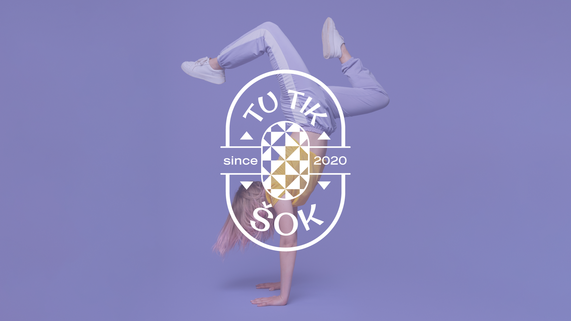
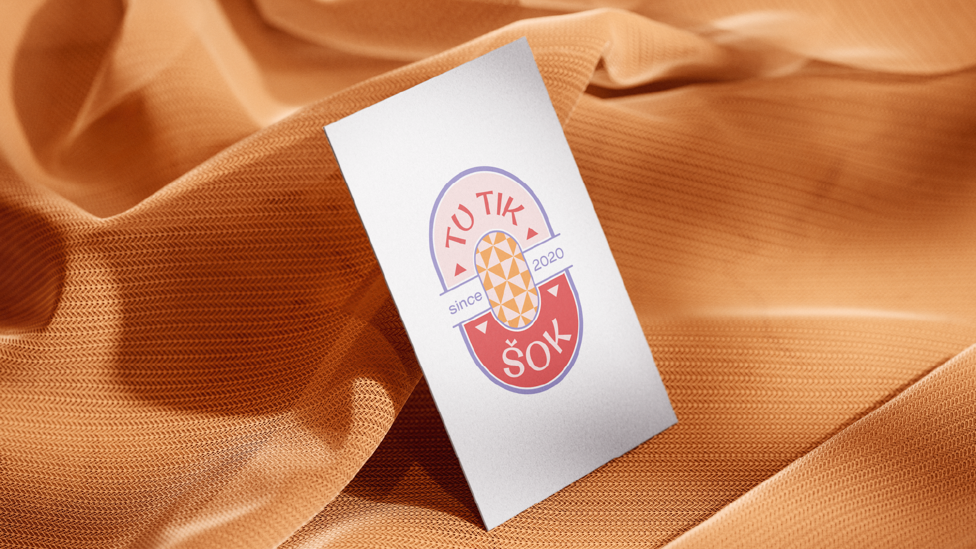
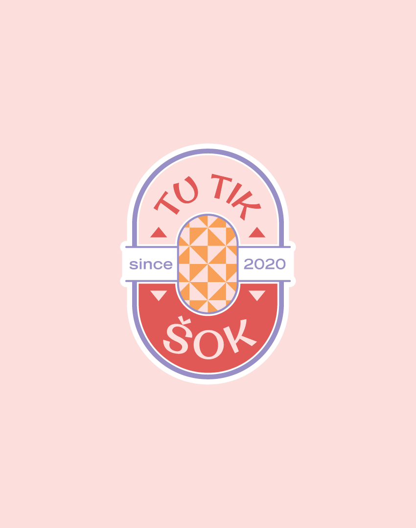
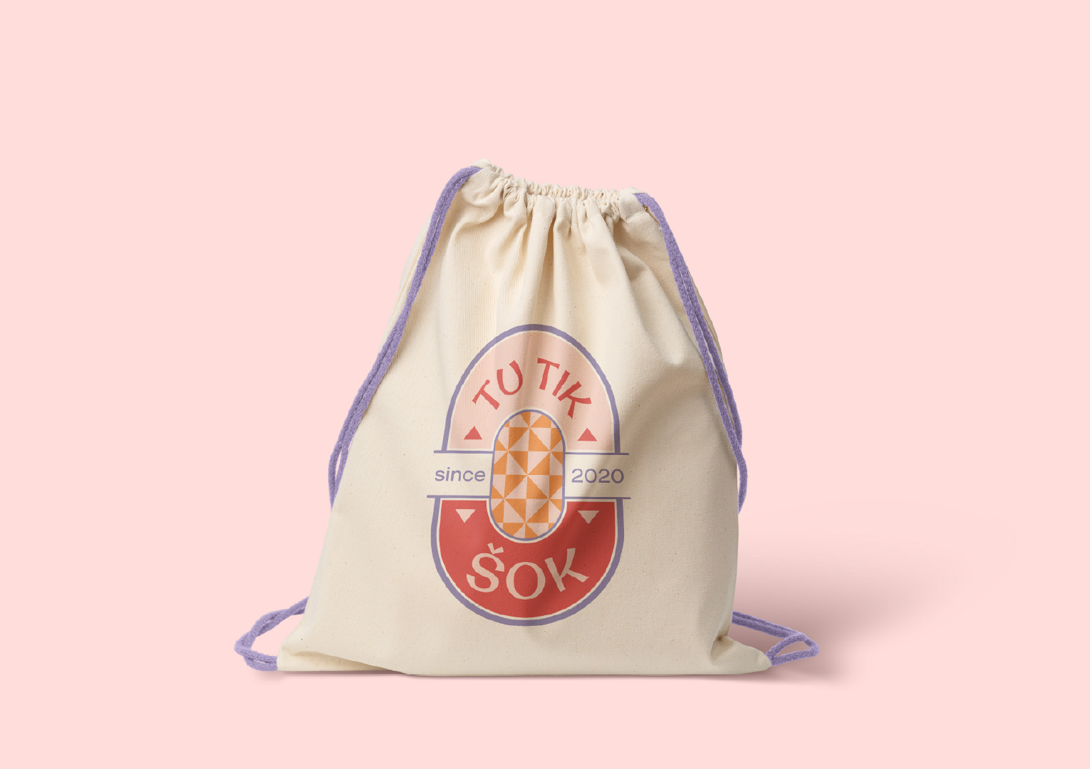
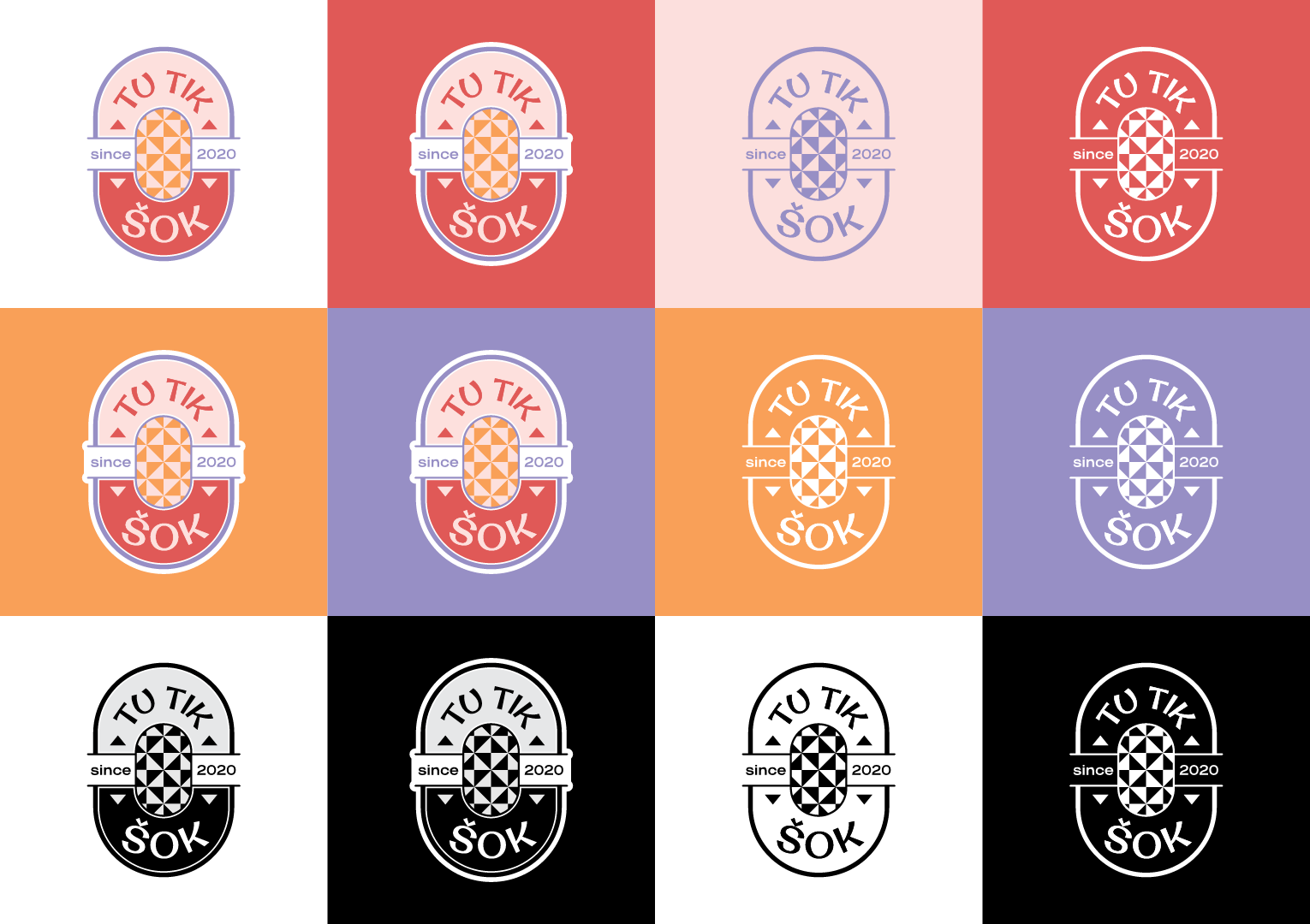
Tu tik šok (English: Just Dance) is a dance studio offering classes for children aged 7 to 14, including dancesport, contemporary dance, and street dance. Marketing Orchestra designed an emblem-style logo and colour palette for the studio. The logo uses a symmetrical composition, geometric shapes, and a playful but highly legible typeface to communicate positive energy. A warm, cheerful palette with a purple accent gives the identity a fresh, vibrant character that suits a young audience and their parents.
Contact us for your project
Tu tik sok Logo design - preview

Project Details

Contact Us

A children’s dance studio needs a logo that works on 2 levels. It has to appeal to children aged 7 to 14, and it has to reassure the parents who choose the studio. For Tu tik šok, a studio teaching dancesport, contemporary dance, and street dance, the brief called for a mark that felt energetic and joyful without looking chaotic or childish.

Marketing Orchestra developed a modern emblem-style logo built around balance. The symmetrical composition and geometric shapes give the mark a clean, stable structure that is easy to remember and easy to apply across formats, from signage to social media profiles. The studio’s founding year, 2020, is part of the emblem, which adds a sense of established credibility.

The triangular motif at the centre of the emblem is the key creative detail. Its angles introduce movement and dynamism into an otherwise symmetrical layout, which echoes the variety of dance styles the studio teaches. The studio name is set in a playful typeface that stays highly legible, so the lettering has personality and still reads clearly at small sizes.

The colour palette is warm and cheerful, combining coral red, orange, and soft pink with white. A lavender purple accent brings freshness and vibrancy to the composition and keeps the warm tones from feeling flat. Together, the colours communicate positive energy and emotion, which is what children and parents expect from a dance class.

About the client

Tu tik šok (English: Just Dance) is a dance studio founded in 2020. It offers classes for children aged 7 to 14 in dancesport, contemporary dance, and street dance. The studio serves children who want to learn dance in an energetic, positive environment, and the parents who choose it for them.
Project completed:
2026
Industry:
Dance education and children’s activities
Location:
Lithuania
Services:
Logo Design, Branding (colour palette)
Contact Us

Project Goals

Marketing Orchestra was engaged to address the following objectives:
Design a logo that communicates positive energy and emotion for a children’s dance studio
Create a memorable, balanced emblem using symmetry and geometric shapes
Reflect the movement and variety of dancesport, contemporary dance, and street dance through a dynamic central motif
Select a typeface that is playful for children and legible for parents at any size
Establish a warm, cheerful colour palette with a purple accent for freshness and vibrancy

What we did

To achieve these objectives, Marketing Orchestra delivered the following:
Designed a modern emblem-style logo with a symmetrical composition and geometric shapes
Developed a central triangular motif to add a sense of movement and dynamism
Selected a playful, highly legible typeface for the studio name
Defined a colour palette of coral red, orange, soft pink, and white, with a lavender purple accent
Incorporated the studio’s founding year into the emblem to support brand credibility

Ready to grow your business?

Schedule a complimentary 30-minute strategy session.

We'll discuss your business goals, marketing challenges, and how Marketing Orchestra's strategic services can harmonize your digital presence.