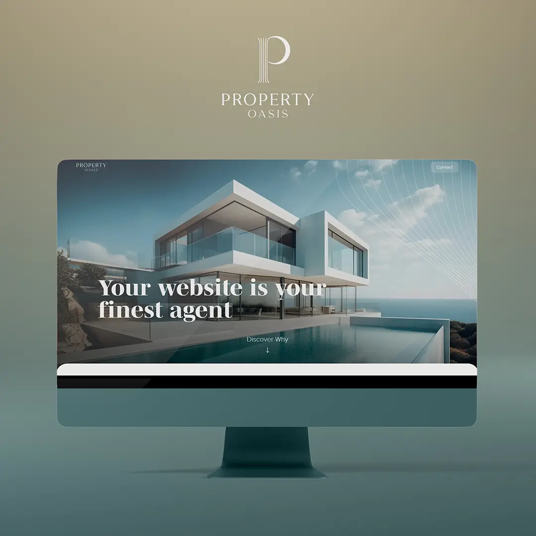


Property Oasis was conceived as a showcase project: a fully realised luxury real estate brand built from the ground up to demonstrate what Marketing Orchestra can deliver for clients in the property sector. Rather than a simple design exercise, it is a complete brand system, including a live website, that prospective real estate clients can experience directly.
The strategic brief was self-defined: create a brand that feels luxurious, sophisticated, and confident, with an underlying sense of power and calm. These qualities were chosen deliberately to reflect the expectations of a high-end real estate audience, where trust, authority, and aesthetic refinement are prerequisites for credibility.
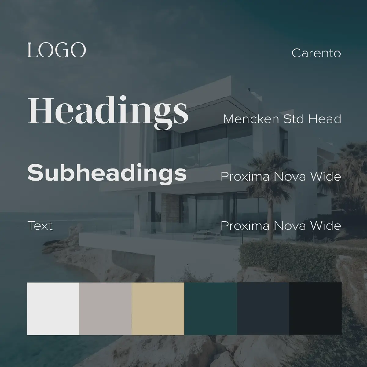
Brand strategy informed every creative decision. Typography was selected with precision across 3 distinct roles: a fluid, calm typeface for the logo; confident, sophisticated heading fonts; and fashionable subheading and body fonts that add weight and polish to the overall system. The colour palette uses rich, warm tones to reinforce the feeling of luxury throughout.
The logo centres on a custom icon representing a column, chosen for its associations with strength and stability. Thin lines keep the mark light and refined, while a solid crescent forming the letter “P” introduces a quiet sense of power. The result is a mark that is elegant without being decorative.
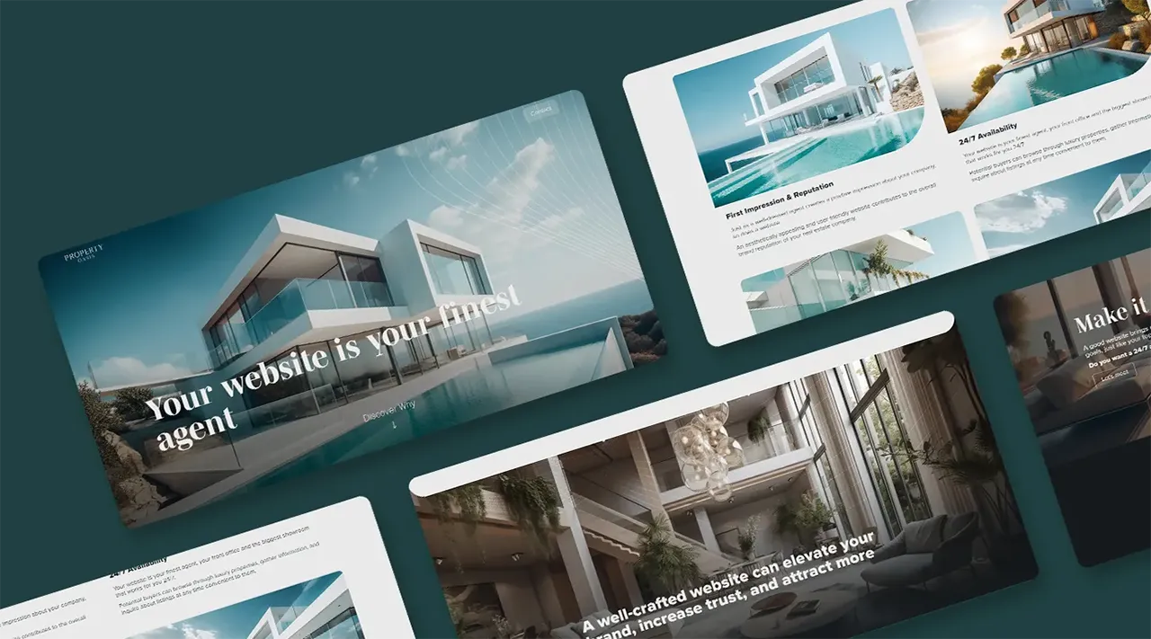
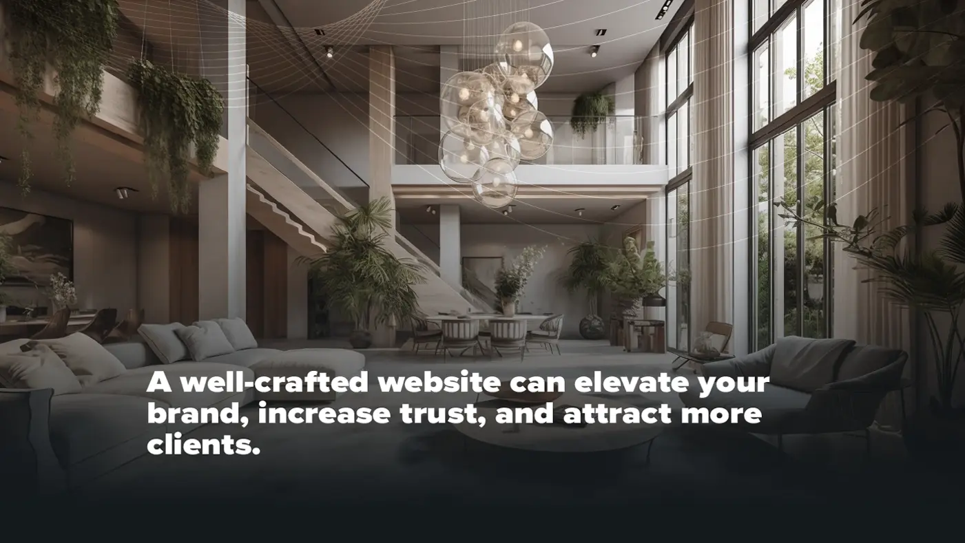
Two bespoke graphic patterns were developed to extend the brand across formats. A curved parallel line pattern was created for printed materials and the desktop website, adding luxury and elegance to larger formats. A separate dotted pattern overlay was designed specifically for the mobile version, preserving the same visual quality and impression on smaller screens. Photography was selected to create an immediate, impactful impression, with gradients and overlays used to maintain readability throughout.
The website itself is fully responsive, with deliberate design adjustments between desktop and mobile versions, including different images, patterns, and layout changes, to ensure the brand experience translates consistently across devices. The site’s content explains the value of strong digital presence in the real estate market and outlines Marketing Orchestra’s services in this sector, making it both a design showcase and a conversion tool.
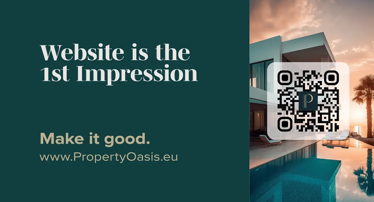
A business card was designed to work in tandem with the website. The QR code on the card, when scanned, opens the website, and a shared background image across card and first fold creates a seamless visual continuation between the physical and digital touchpoints.

