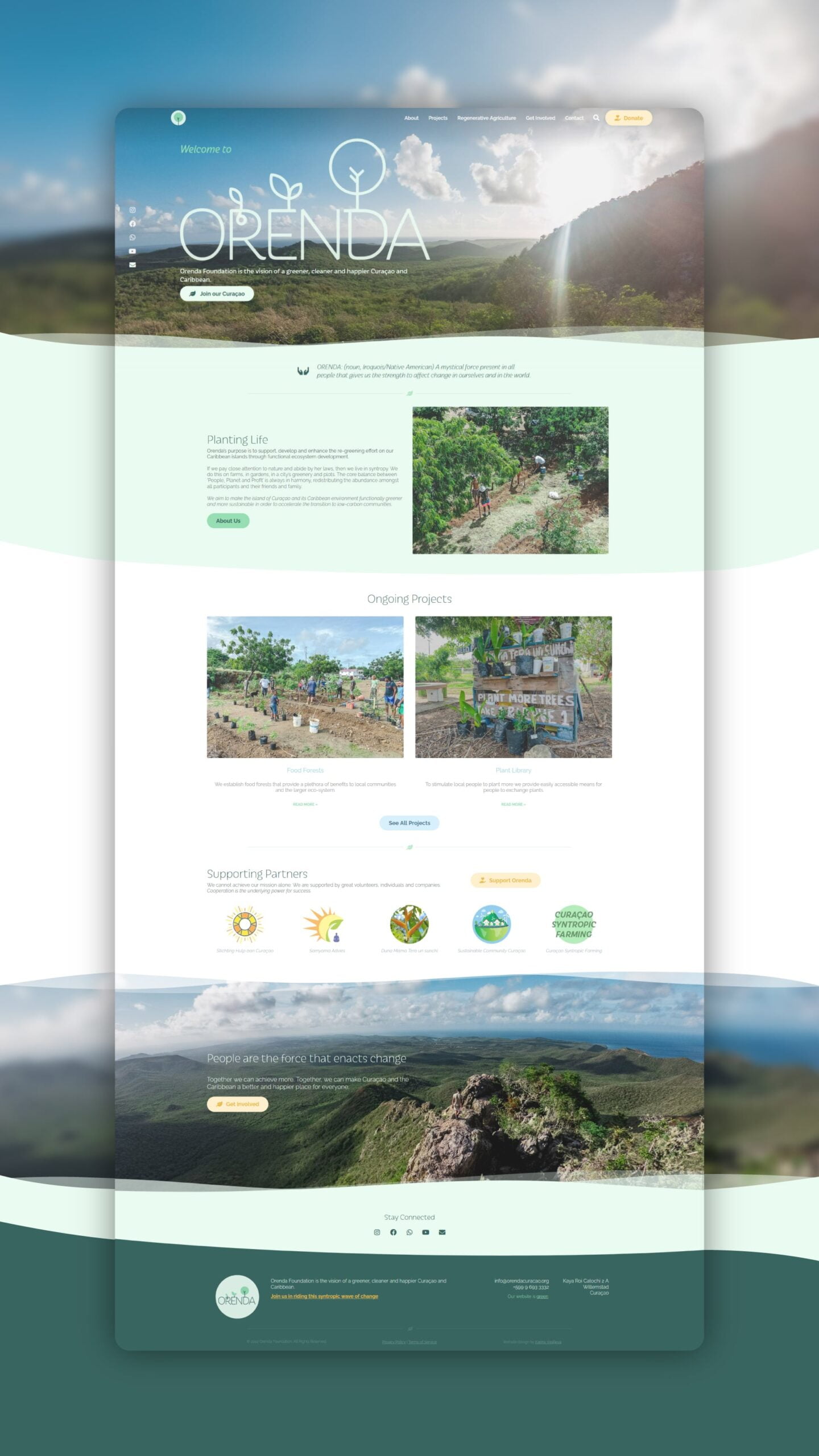
Orenda Foundation operates at the heart of Curaçao’s environmental future. The organisation plants and maintains private gardens and public food forests, promotes sustainable and regenerative agriculture, and builds a community of people committed to sharing knowledge and resources. Their work is simultaneously ecological and social: restoring the island’s natural environment while strengthening the bonds between the people who live there.
When Orenda approached Marketing Orchestra, the brief was clear: design a logo and build a website that could carry the foundation’s mission to the public, attract volunteers and donors, and reflect the warmth and optimism at the heart of their work.
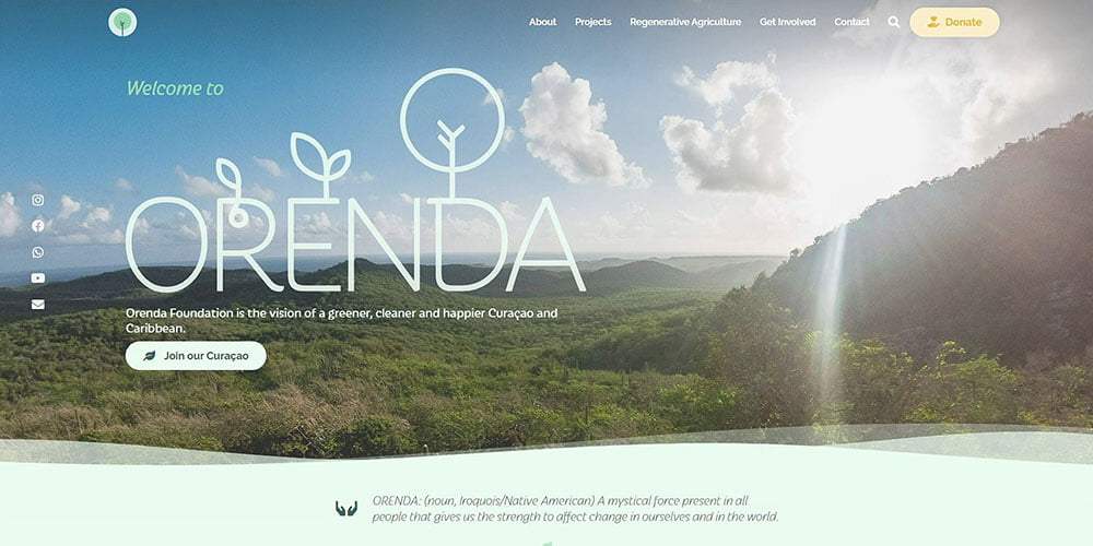
The logo design began with a strategic question: what does Orenda stand for? Growth, regeneration, community, and openness to nature. A growing tree became the central visual symbol, chosen for its ability to communicate new life, progression, and reforestation in a single, immediately recognisable mark. The typography adds a human quality to the design, drawing on an ethnic style that balances warmth with professionalism. The colour palette moves away from conventional shades of green, opting instead for rich, bright tones that feel cheerful and distinctive while remaining firmly rooted in the natural world.
The website extends this identity into a fully functional platform built to serve Orenda’s operational needs. Its primary purposes are to inform the public about the foundation’s vision and ongoing projects, connect community members with volunteering and educational opportunities, and collect donations to sustain the foundation financially. The visual direction of the site reflects the Curaçao that Orenda is working to create: lush, warm, and full of possibility. Photography and design work together to inspire visitors and invite them to become part of the mission.

