


Lake Bridge Park is a concept for an urban park in Coimbra, Portugal: a green oasis designed to offer city residents and visitors a refuge from urban life. The park’s defining characteristic is its landscape of interconnected lakes, spanned by more than 20 bridges. Beyond its natural setting, the park accommodates a wide range of activities, from cycling and skating to open-air cinema, concerts, cafés, and water sports, making it a destination for people of all ages and interests.
Marketing Orchestra developed this project as a self-initiated creative exercise, exploring how a brand identity can translate a place’s spirit into a cohesive visual language. The central strategic idea was straightforward: the bridge is not just a physical feature of the park, it is a metaphor for the relationship between people and nature. Every element of the identity was built outward from that idea.
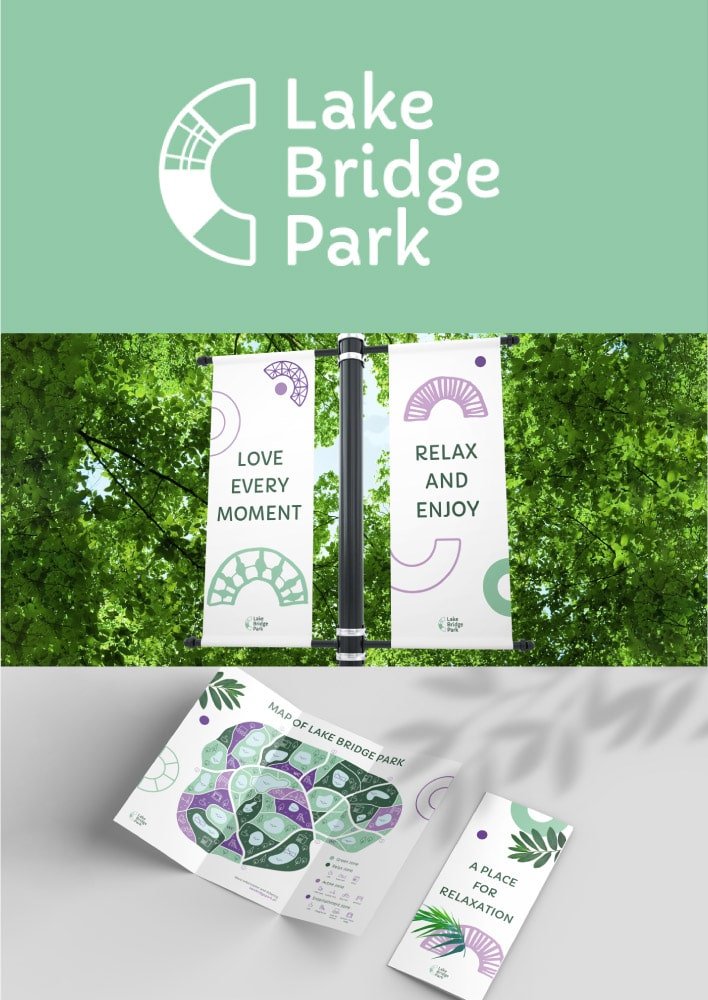
The result is a visual system that feels warm, open, and gently playful. The colour palette and photographic direction evoke calm and comfort, reflecting the restorative experience the park offers. Typography was selected for its character as much as its legibility: specific letterforms in the chosen font carry a lightness and openness that reinforces the brand’s personality without overstating it.
The logo brings the concept into its sharpest form. A custom symbol, designed to suggest the arc of a bridge, is divided into distinct segments that simultaneously reference the park’s many bridges and the variety of activities available within it. Paired with the wordmark, the logo communicates connection, movement, and natural harmony in a single, considered mark.

