


Elena’s private community exists to do something quietly powerful: give women a space to feel supported, seen, and motivated. The content she publishes spans mental health guidance, educational resources, and inspirational storytelling, all serving a global audience with diverse backgrounds and emotional needs.
To support this mission, Marketing Orchestra developed a cohesive visual language from the ground up. Brand strategy informed every creative decision, ensuring the illustrations would not only resonate emotionally but also build long-term recognition across Elena’s content. A consistent colour palette and illustrative style were established early in the process, creating a visual identity that feels unified and intentional across all formats.
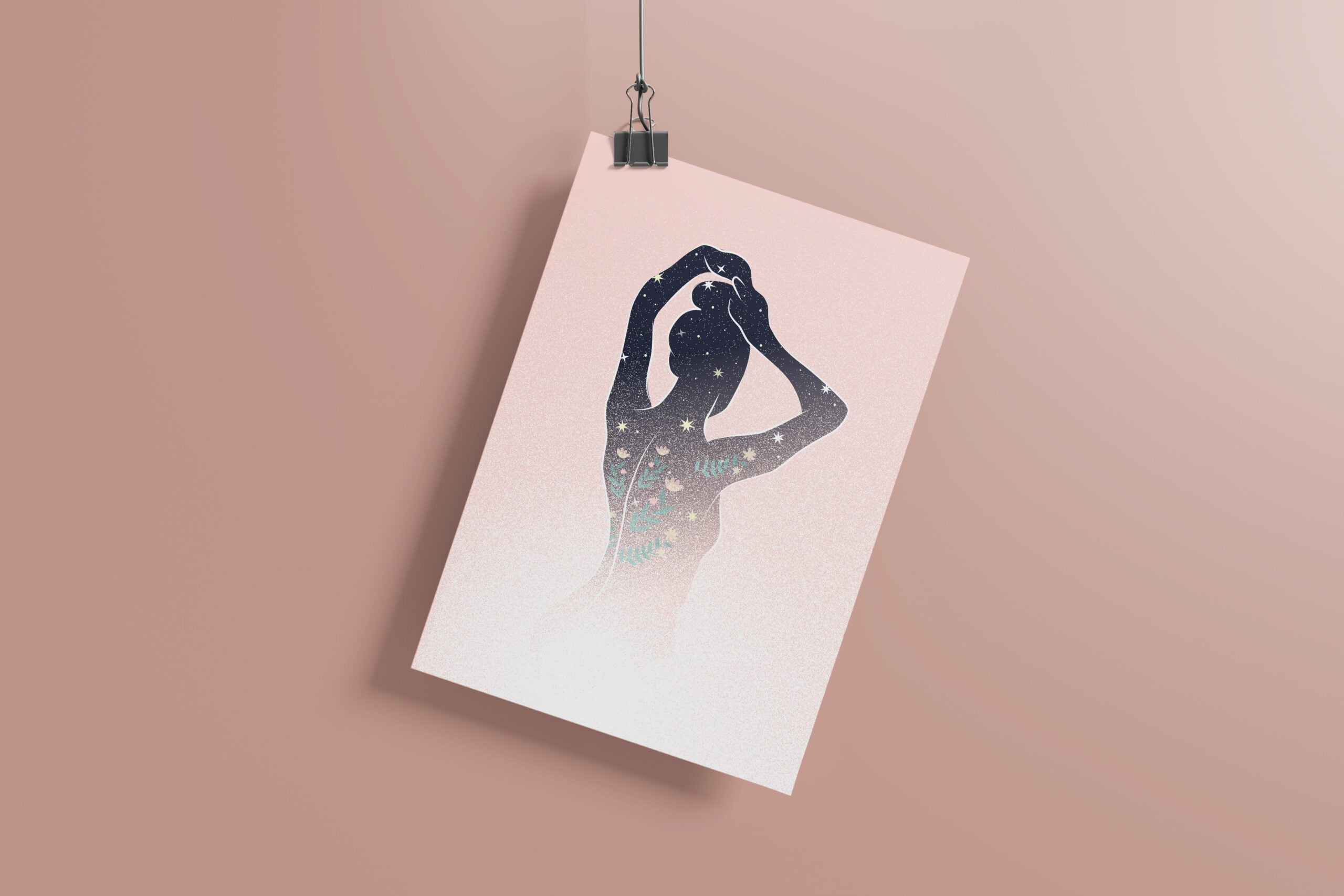
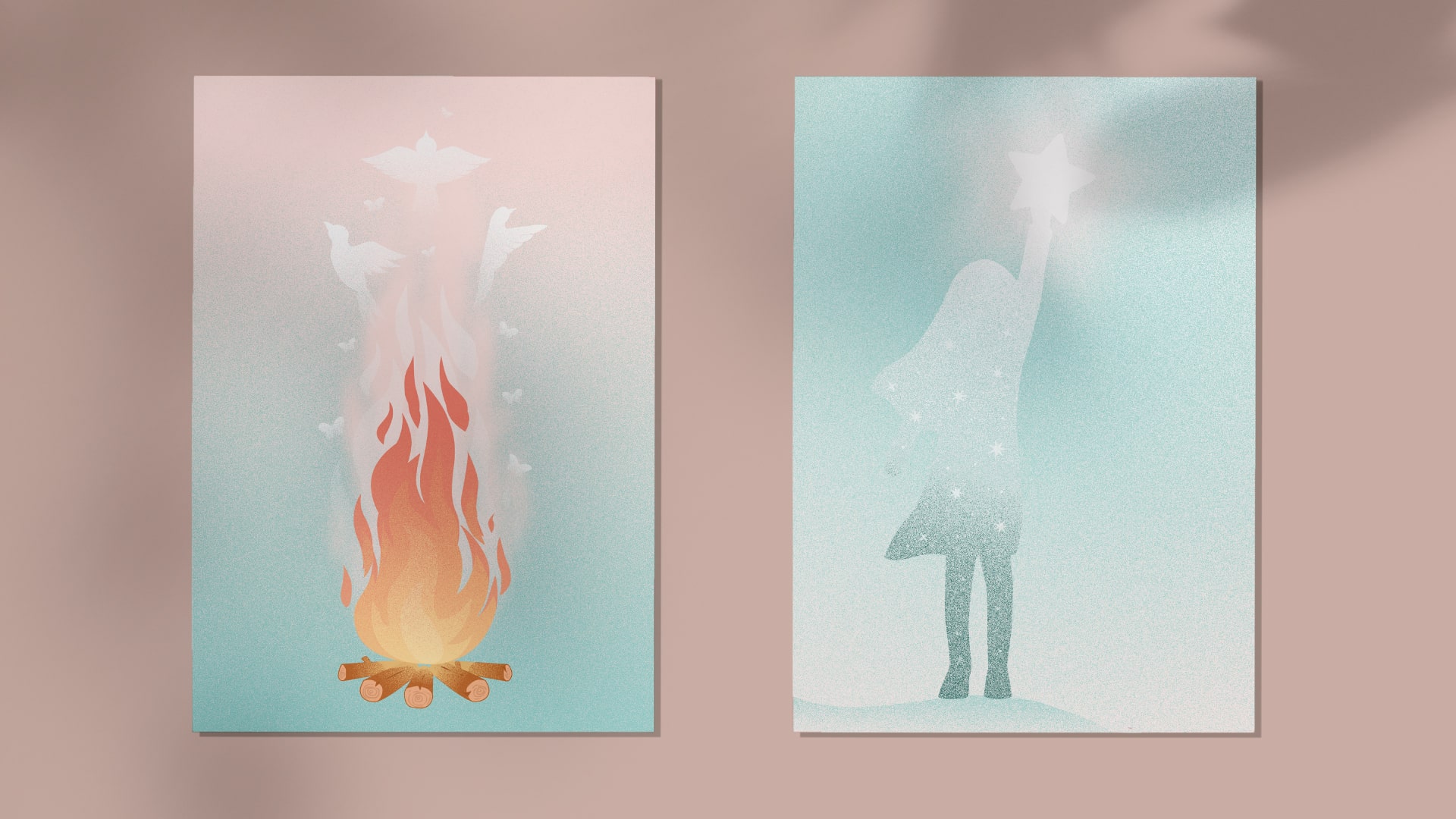
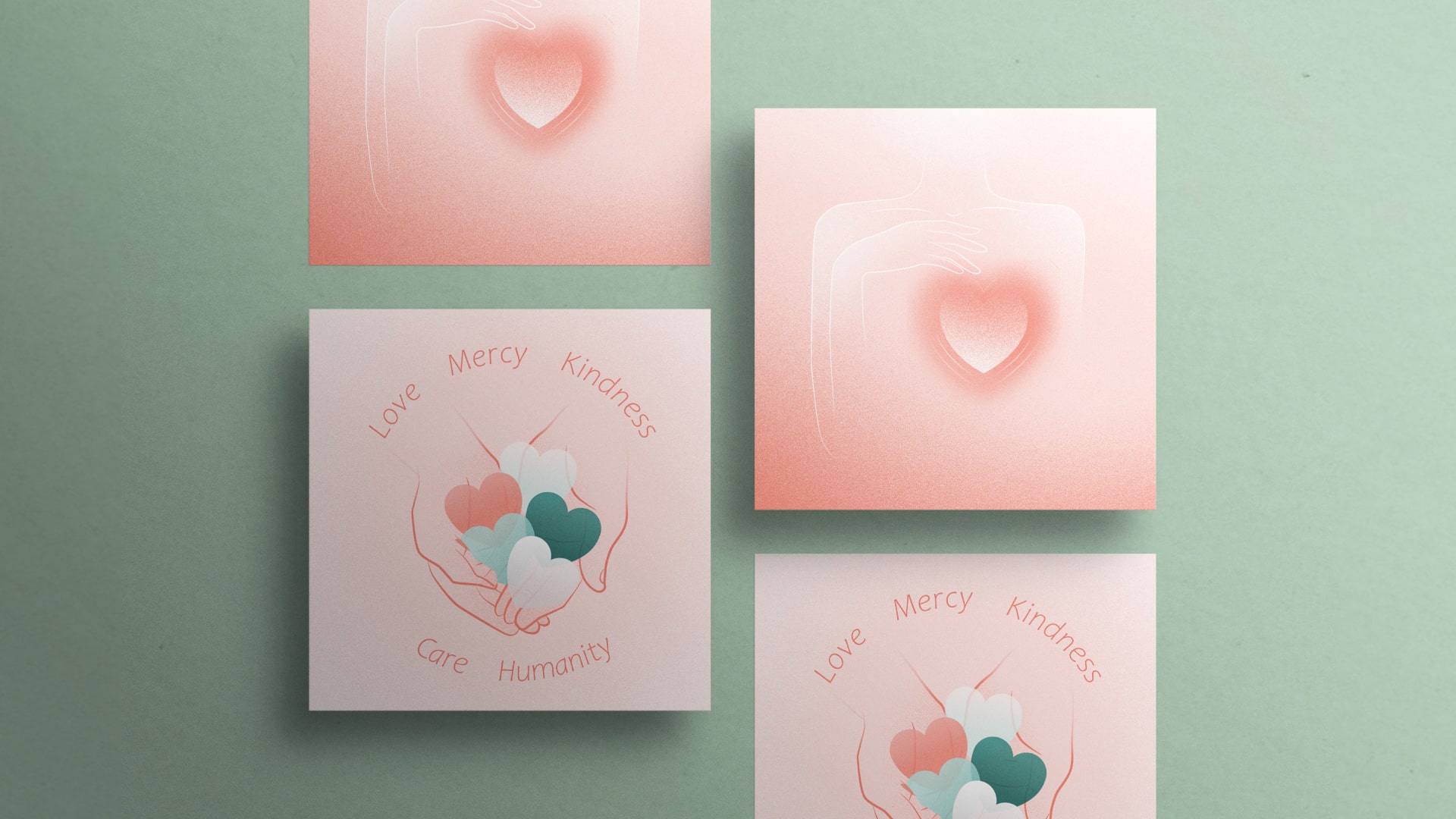
The 20 original illustrations were each designed to reflect the core message of the quote or story they accompany. Rather than decorative additions, they function as visual interpretations, translating emotional and narrative themes into imagery that communicates comfort, hope, and warmth. The style draws on the gentleness of children’s book illustration, using soft forms and considered composition to create content that feels safe and uplifting.
Ten video backgrounds were produced alongside the illustrations, extending the visual identity into motion content. All assets, whether static or video, share the same palette and aesthetic, ensuring consistency across every touchpoint in Elena’s content ecosystem.

