Opens in a new tab
Portfolio
Graphic Design

Gheeronimo Label Design

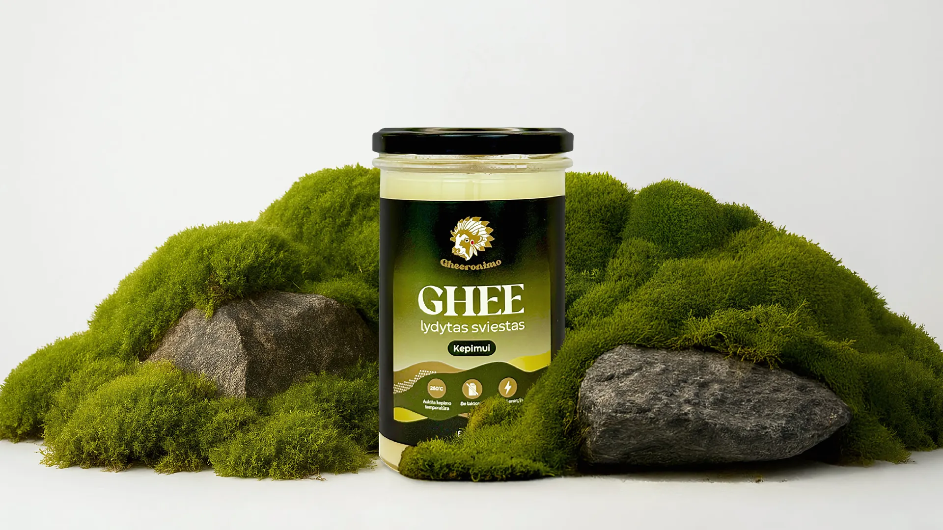
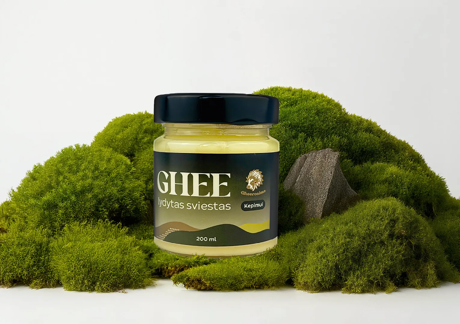
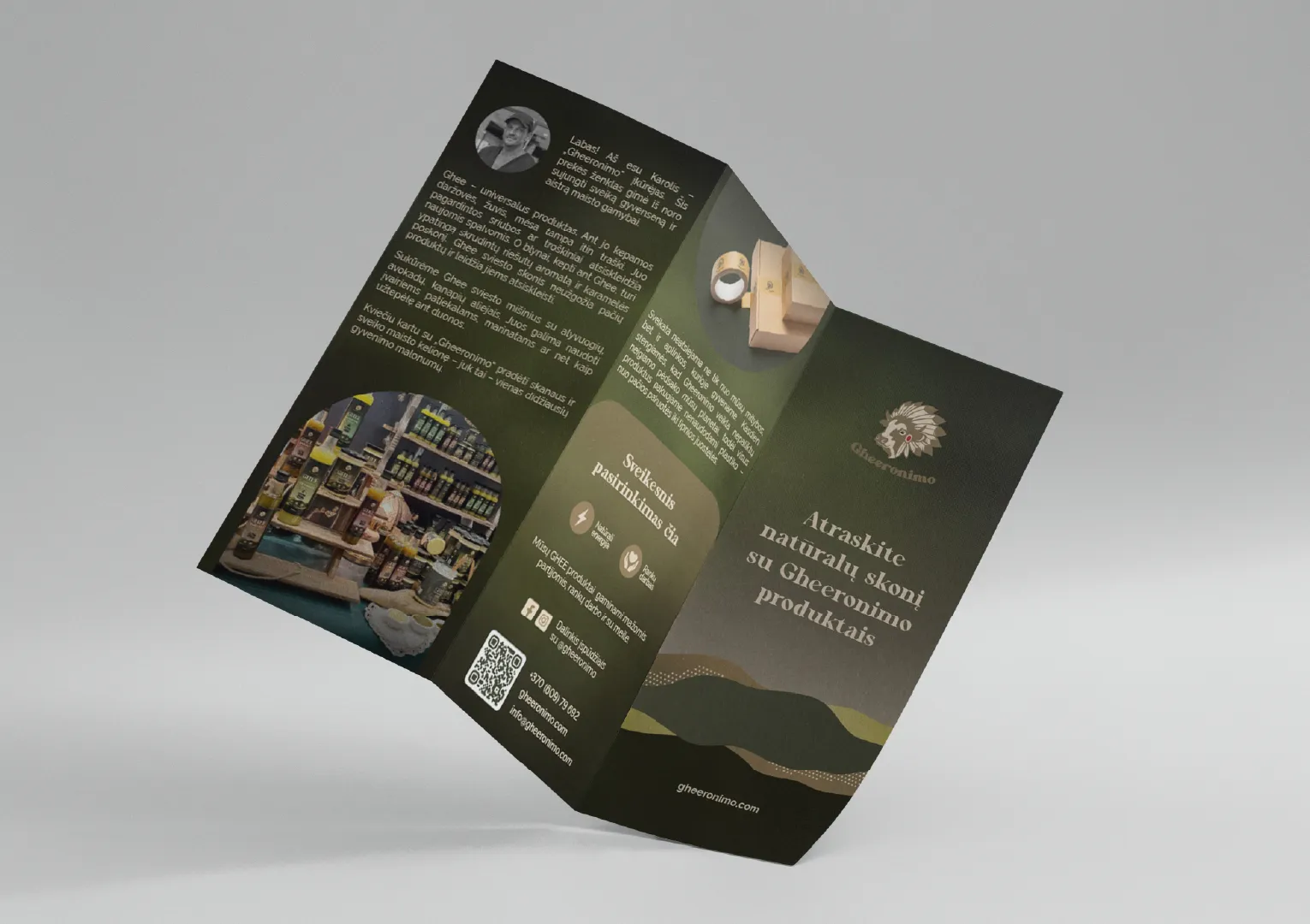
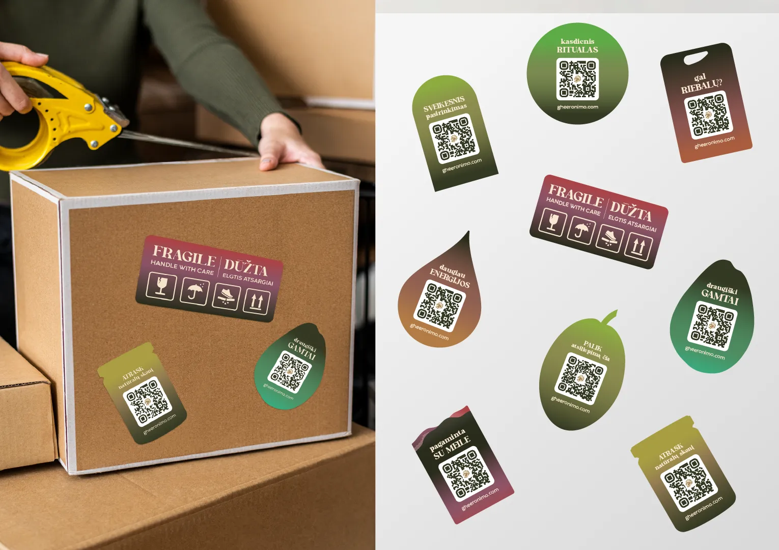
Gheeronimo is the first brand in Lithuania specialising in clarified ghee butter and other natural, healthy oil products. Marketing Orchestra delivered graphic design for the brand across 2 projects: a redesign of the existing product labels, and the label design for a new range of naturally aged white wine vinegar dressings. The work included colour-coded product labels, an updated tri-fold brochure, and stickers. Each label was designed to make the product more distinctive on the shelf and to communicate its character at a glance.
Contact us for your project
Gheeronimo Dressing Label Design Graphic Design

Project Details

Contact Us

Gheeronimo occupies a clear position in the Lithuanian food market. As the first brand in the country dedicated to clarified ghee butter and natural oil products, it introduces a category that many shoppers are still discovering. In a new category, packaging carries a lot of the work: it has to attract attention, tell customers what the product is, and distinguish one product from another.

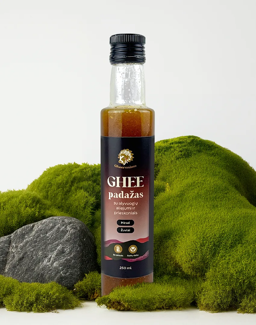
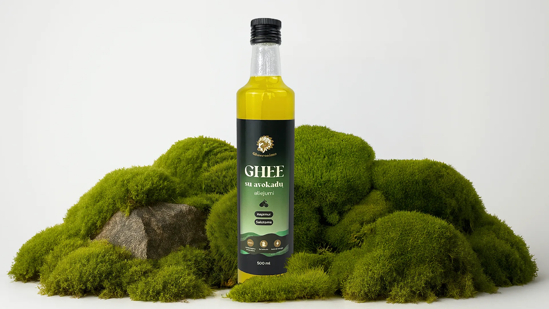
The first project was a redesign of Gheeronimo’s existing labels. The brief was to make them bolder and more visually appealing, and to differentiate each product by colour. A clear colour system lets customers recognise and tell apart products within the range, and gives the brand a stronger presence when several products sit side by side. The tri-fold brochure was updated to match the new label direction, and a set of stickers was created as part of the same redesign.

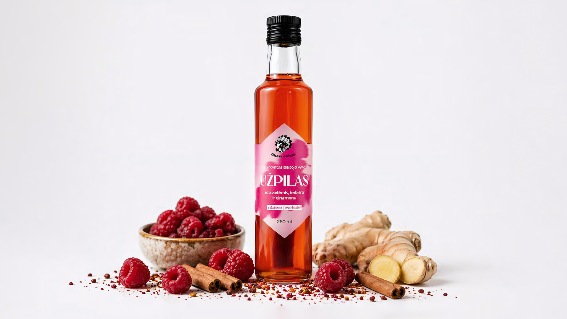
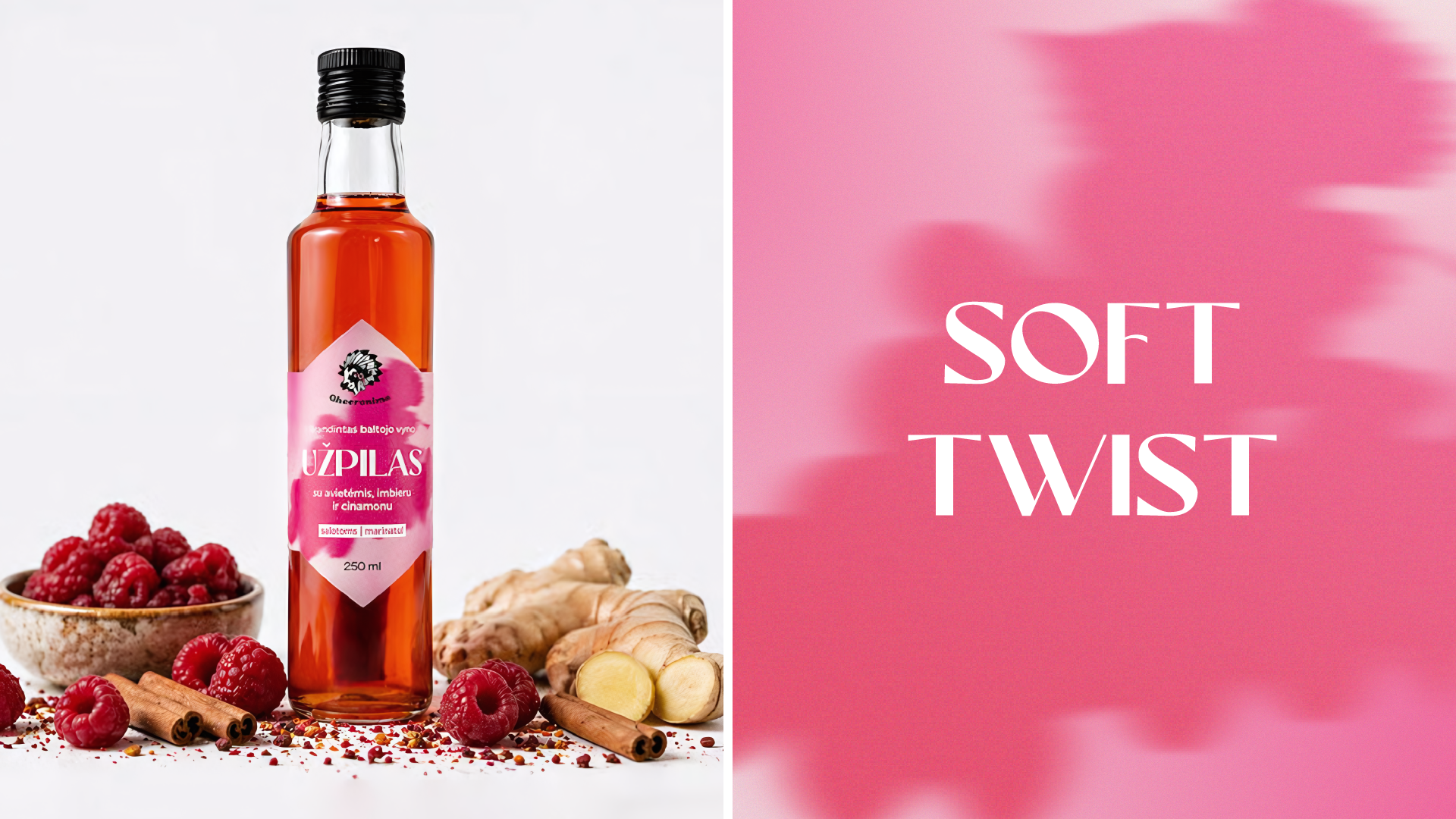
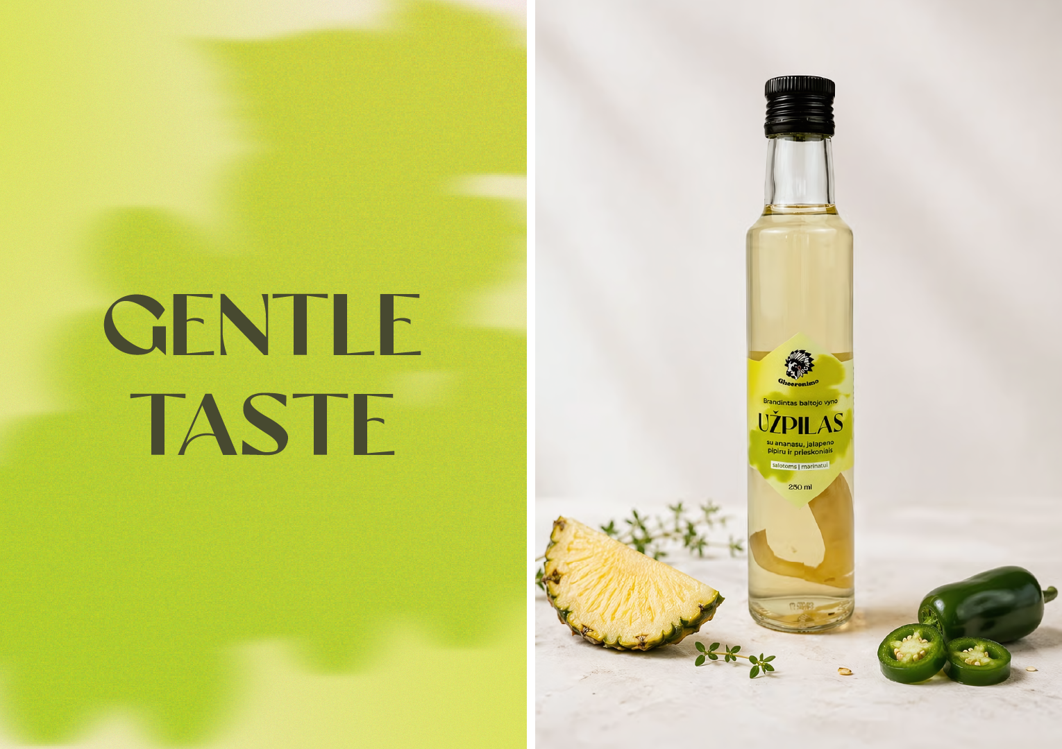
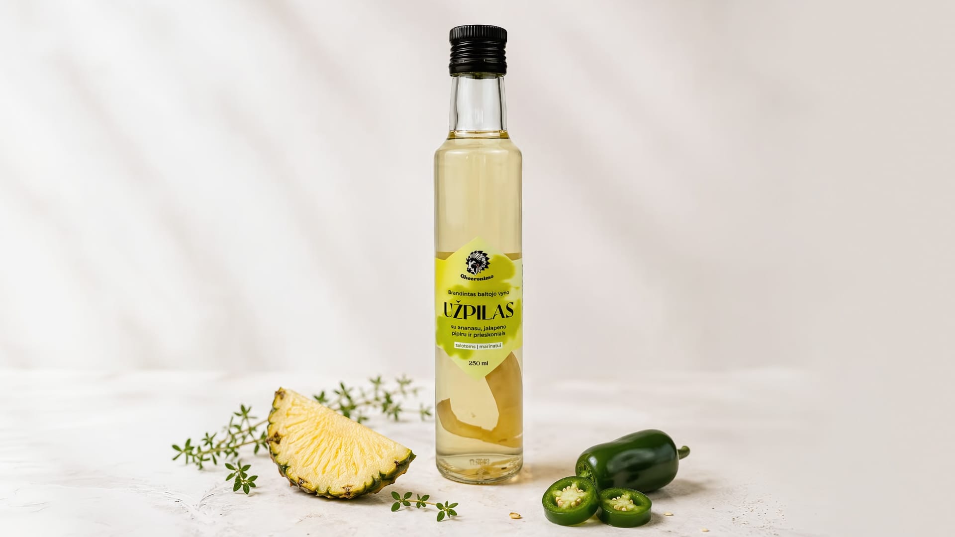
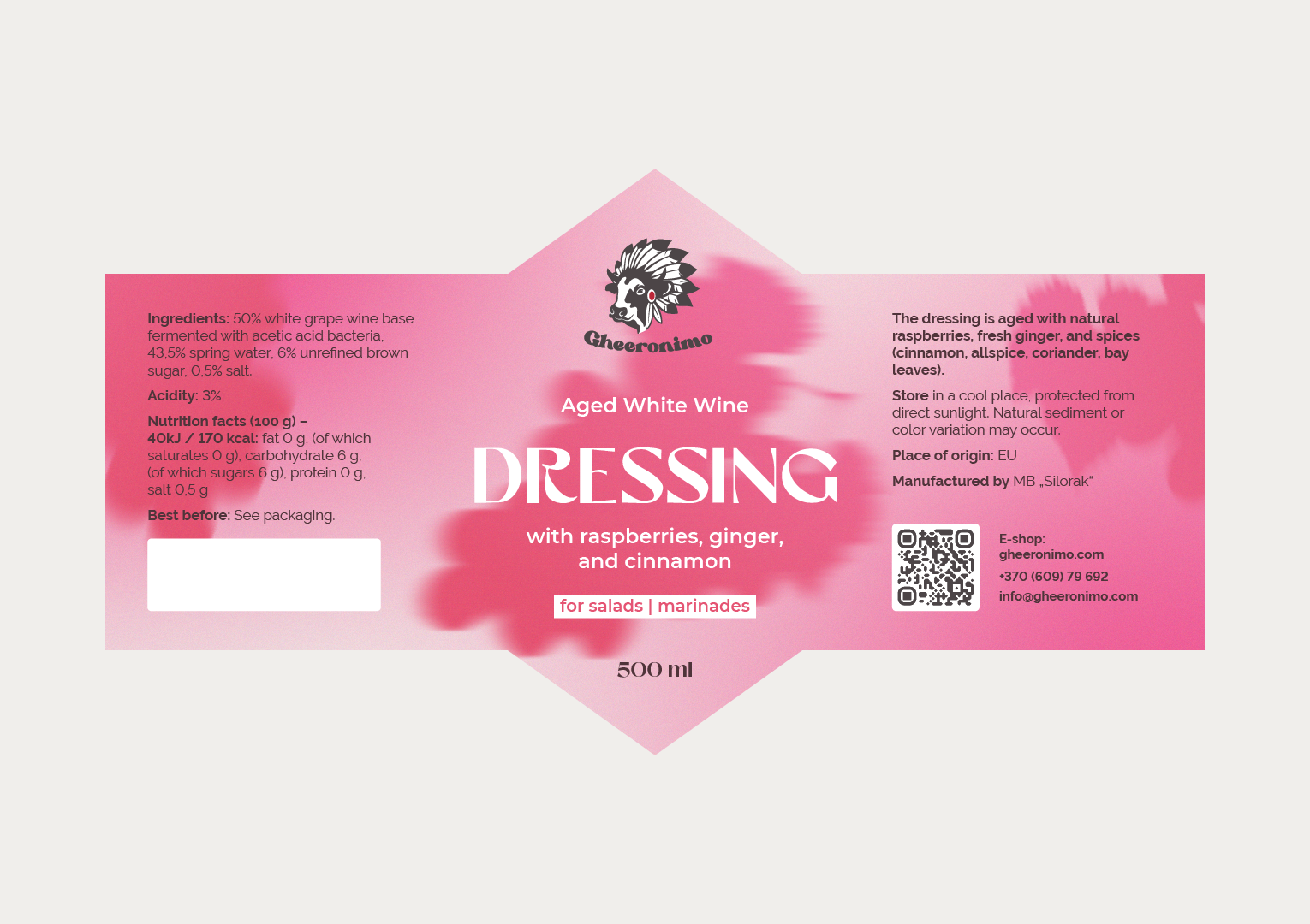
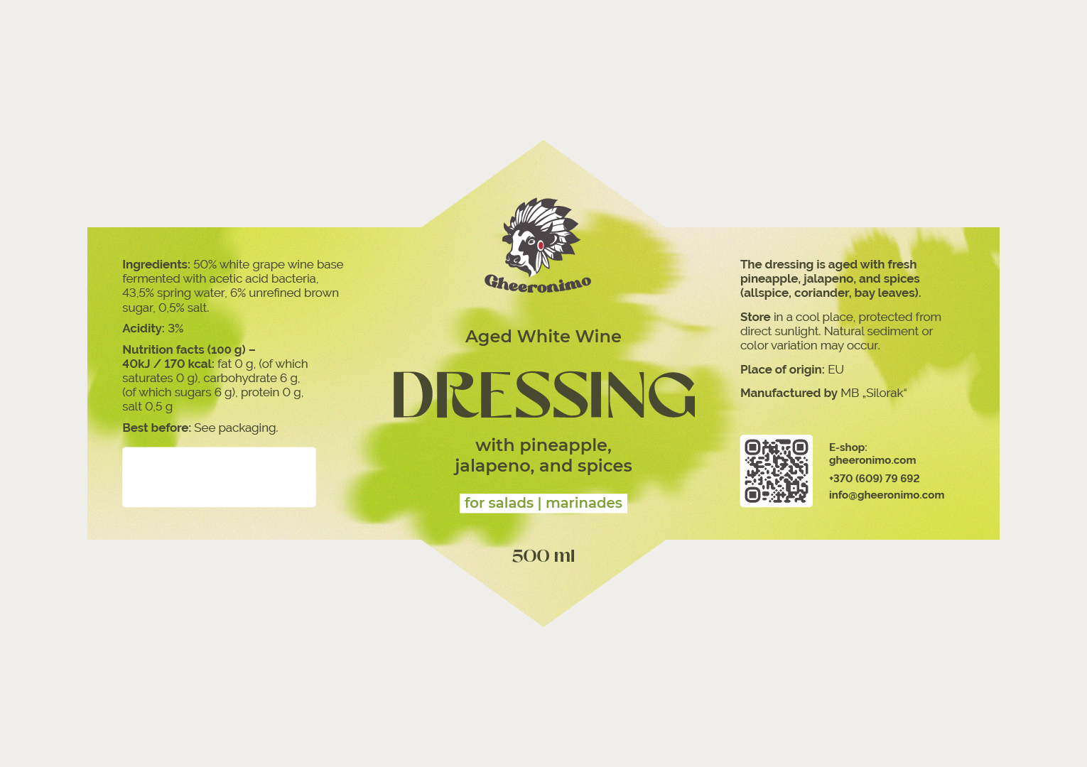
The second project extended the brand into dressings. Gheeronimo dressings are naturally aged white wine vinegars, available in 2 flavours. The yellow dressing combines pineapple and jalapeño for a balance of sweetness, acidity, and gentle spice. The pink dressing combines raspberries, ginger, and cinnamon for a soft, fruity flavour with a light spice.

The label design translates these flavour profiles into visual language. Light, soft colour transitions flow across each label, with a subtle grain texture that gives the design a natural, tactile quality. The colours communicate the mood and intensity of each dressing’s ingredients, so the label conveys the sensory experience of the flavour as well as the product information. A playful, characterful typeface adds liveliness and lightness while keeping the identity modern and warm.

The project was delivered by Marketing Orchestra design lead Victoria Ivanova, with an AI-generated scene background created by Zlata Riabova.

About the client

Gheeronimo is a Lithuanian food brand and the first in the country to specialise in clarified ghee butter and other natural, healthy oil products. Its range also includes naturally aged white wine vinegar dressings in pineapple and jalapeño and raspberry, ginger, and cinnamon flavours. The brand serves customers looking for natural, high-quality ingredients and distinctive flavours.
Project completed:
2025
Industry:
Food and beverage (natural food products)
Location:
Lithuania
Services:
Graphic Design, Lable Design, Print Design (tri-fold brochure and stickers)
Contact Us

Project Goals

Marketing Orchestra was engaged to address the following objectives:
Redesign Gheeronimo’s existing product labels to be bolder and more visually appealing
Introduce a colour-coded system so each product in the range is clearly differentiated
Design labels for 2 new dressing flavours that communicate the taste and character of each product visually
Maintain a cohesive brand identity across ghee, oil, and dressing products
Extend the updated visual direction to supporting print materials, including the tri-fold brochure and stickers

What we did

To achieve these objectives, Marketing Orchestra delivered the following:
Redesigned the existing Gheeronimo product labels with a bolder look and a distinct colour for each product
Updated the tri-fold brochure to align with the redesigned labels
Created a set of stickers as part of the redesign
Designed labels for the yellow (pineapple and jalapeño) and pink (raspberry, ginger, and cinnamon) dressings, using organic colour transitions and a subtle grain texture
Selected a playful, characterful typeface to give the dressing labels a lively, modern, and warm character
Produced an AI-generated scene background in collaboration with Zlata Riabova to support the visual presentation

Ready to grow your business?

Schedule a complimentary 30-minute strategy session.

We'll discuss your business goals, marketing challenges, and how Marketing Orchestra's strategic services can harmonize your digital presence.