


Fabrique occupies a distinctive position in Klaipeda’s creative and active lifestyle scene. The space brings together a bouldering wall and a co-working area under one roof, built on the philosophy that pushing physical limits and reaching professional ones are not separate pursuits but the same impulse expressed in different forms. The name itself carries history: “Fabrique” is French for “factory,” a direct reference to the building’s origins as a sewing factory, a piece of heritage the founders were determined to honour.
Marketing Orchestra was engaged to develop a brand identity that could carry all of this, the boldness, the history, the playfulness, the ambition, without flattening it into something generic. The strategic direction centred on 4 qualities: brave, modern, free, and authentic. Every creative decision was tested against them.
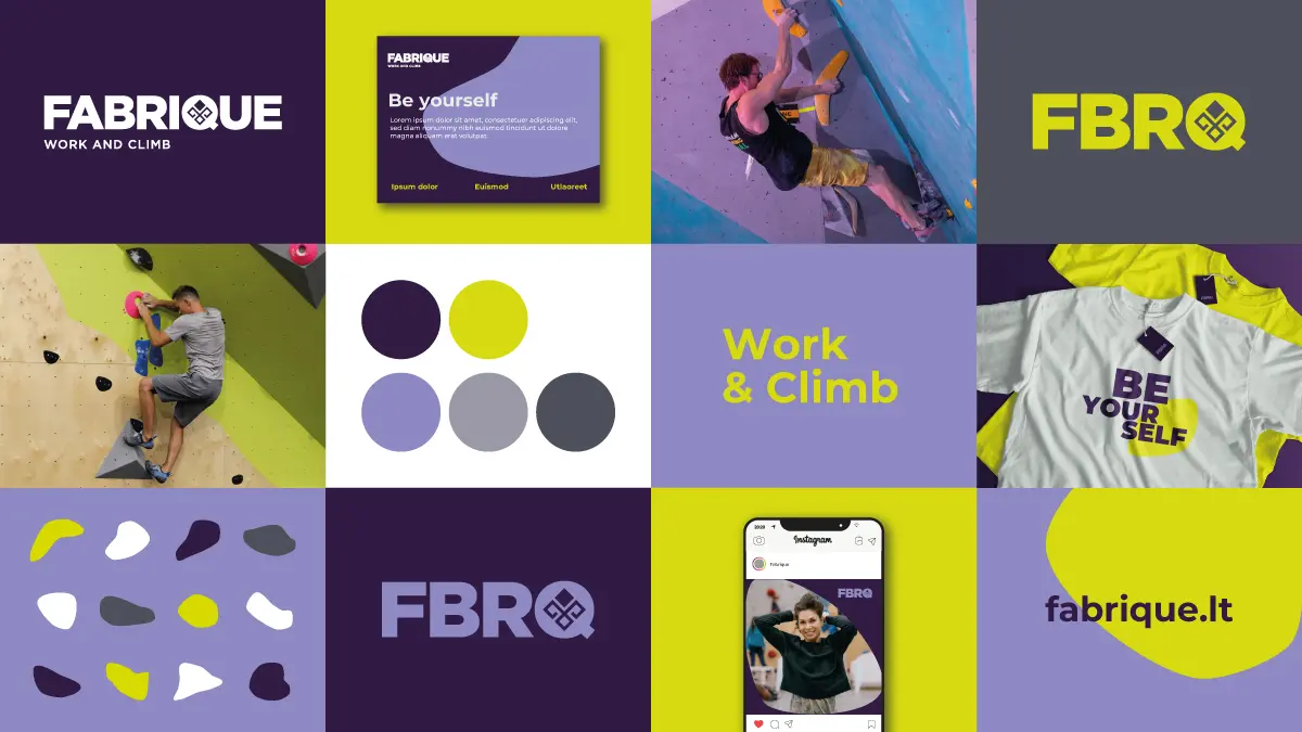
The logo is typographic, built around the full name FABRIQUE and its shortform FBRQ, paired with a tagline. Gotham was selected as the primary typeface: geometric, bold, and expressive, it communicates exactly the kind of confident energy Fabrique stands for. The defining creative detail is embedded within the letter “Q,” which incorporates a stylised Slavic Dazhbog Summer symbol. This ancient symbol carries deep cultural resonance and serves as a direct visual link to Fabrique’s geographic and historical roots, grounding the modern brand in something older and more meaningful.
The colour palette was built around two rich shades of purple, warm and powerful, accented with a sharp neon yellow. The contrast between these tones creates a visual tension that mirrors Fabrique’s own energy: grounded and bold, with a streak of playfulness that keeps it from taking itself too seriously.
Graphic elements were drawn from the bouldering environment itself. Climbing wall holds, in various shapes and shades, were adapted as decorative elements and photo frames. They function as a visual bridge between the two worlds Fabrique inhabits, sport and work, and give the brand a flexible, distinctive toolkit for communications across formats.
The full brand identity system includes rules for applying all elements consistently, ensuring Fabrique’s visual language remains coherent across every touchpoint.

